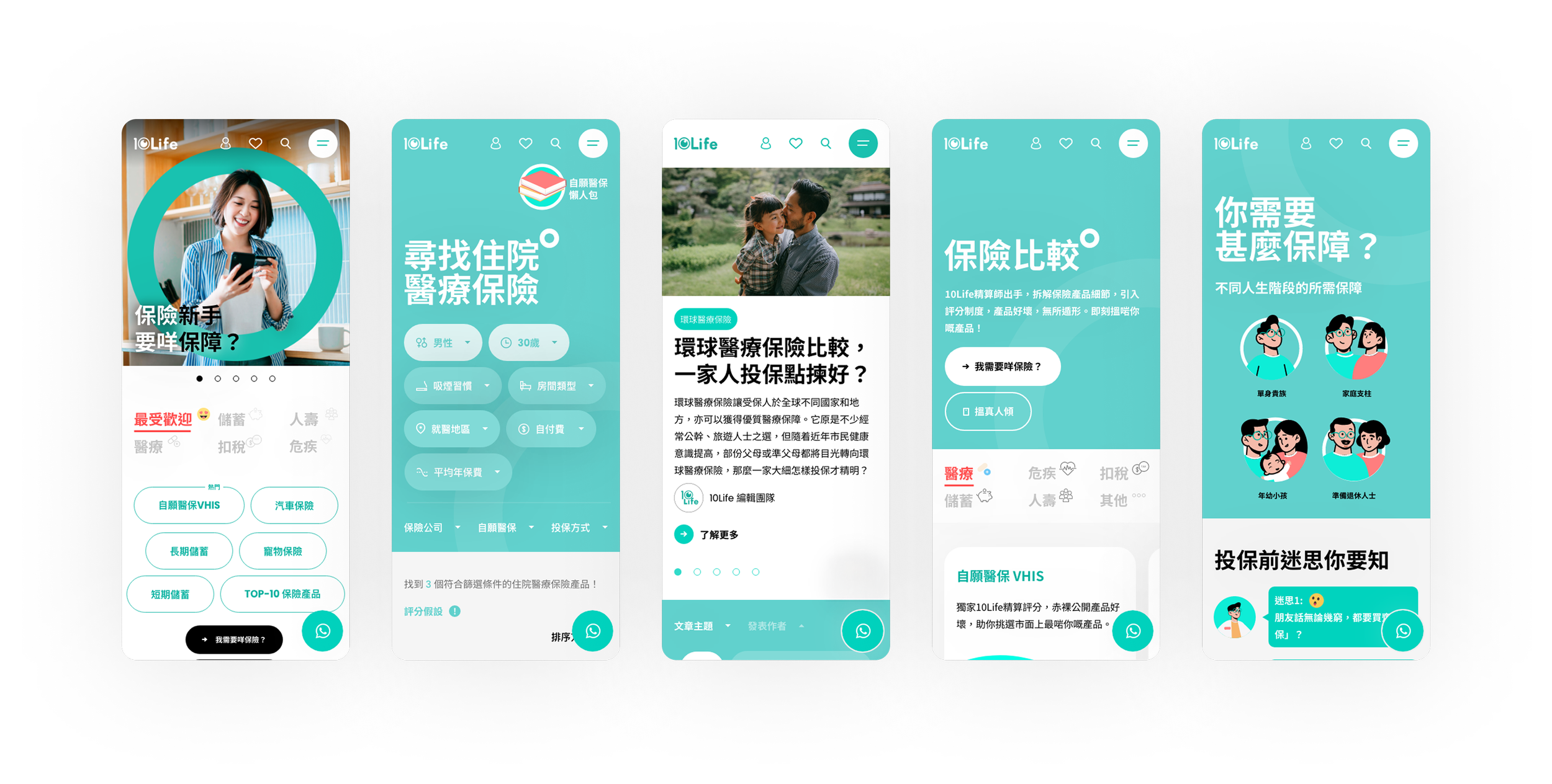
10Life website revamp
10Life website revamp
my role :
ux design / ui design / branding
timeline :
2022 - 2023
The problem
(Information overload)
Hong Kong's insurance market is opaque. Consumers faced severe Information Overload and analysis paralysis due to complex jargon and 1,000+ confusing products. Meanwhile, "misselling" costs the industry millions annually.
The business challenge
(conflicting incentives)
Despite high traffic, 10Life faced low lead generation (conversion) because the platform struggled to balance three conflicting business incentives:
Consumers want unbiased truth and transparent rankings.
Agents want high-quality leads.
Insurers want positive brand exposure.
The goal
To transform 1,000+ complex insurance products into a high-converting, self-serve platform by offering transparent ratings, life-stage guidance, and expert Q&A. Ultimately, we aimed to shift insurance discovery from a confusing, transactional process into a guided and trustworthy experience
The insurance market is broken. It is simply not answering what users actually need.
We conducted over 40 research tests on our current website and other competitive platforms.
Current State
78% felt confused by jargon-heavy actuarial terminology.
82% lacked a clear starting point and wanted guided discovery.
73% doubted agent objectivity due to commission-driven incentives.
84% struggled to compare fragmented information across different sources.
89% experienced "analysis paralysis" due to overwhelming choice (500+ products).
65% didn't trust traditional advisor rankings ("Are they just selling to me?").
VS
What User Need
✓ Clarity (What do I need?): Jargon-free, Provide clear explanations so users actually understand what they are buying.
✓ Guidance (Who helps me?): Personalized recommendations based on their specific life stage, rather than a raw, unguided database dump.
✓ Trust (Can I believe this?): Unbiased, data-driven product scores (like a 10/10 rating) that are completely decoupled from agent commissions.
✓ Speed (Not 30 min research): Smart comparison tools that highlight differences instantly, cutting research time from 30 minutes down to 30 seconds.
User ecosystem & prioritization
USER GROUP 1: END CONSUMERS(Primary, Highest Priority ★★★★★)
Anson (Age 35, Single Professional)
✓ "I lack confidence in insurance agents"
✓ "I want unbiased product rankings for my current policy"
✓ "I want to compare options quickly without feeling sold to"
Motivation: Information-driven, trust-seeking
Our platform serves a 3-sided marketplace: Consumers, Advisors, and Insurers. But to make this marketplace thrive, we had to ruthlessly prioritize the End Consumer. By solving their friction, we naturally delivered the leads and exposure the other two groups wanted.

USER GROUP 2: INSURANCE AGENTS/ADVISORS (Secondary ★★★★★)
Norman (Age 40, Financial Advisor)
✓ I need leads from 10Life's platform
✓ "Product Decoder helps me pitch better to clients
✓ "Anonymous Q&A is my #1 lead gen channel (2-3 leads/month)
Motivation:Business growth, credibility enhancement

USER GROUP 3: INSURANCE COMPANIES (Secondary ★★★)
Eric (Insurance Company Marketing Lead)
✓ We need more exposure and a credible referral channel
✓ We want consumer behavior insights for retargeting
✓ Provide protection gap analysis tools for agent pitches
Motivation: Brand visibility, lead quality, market insights

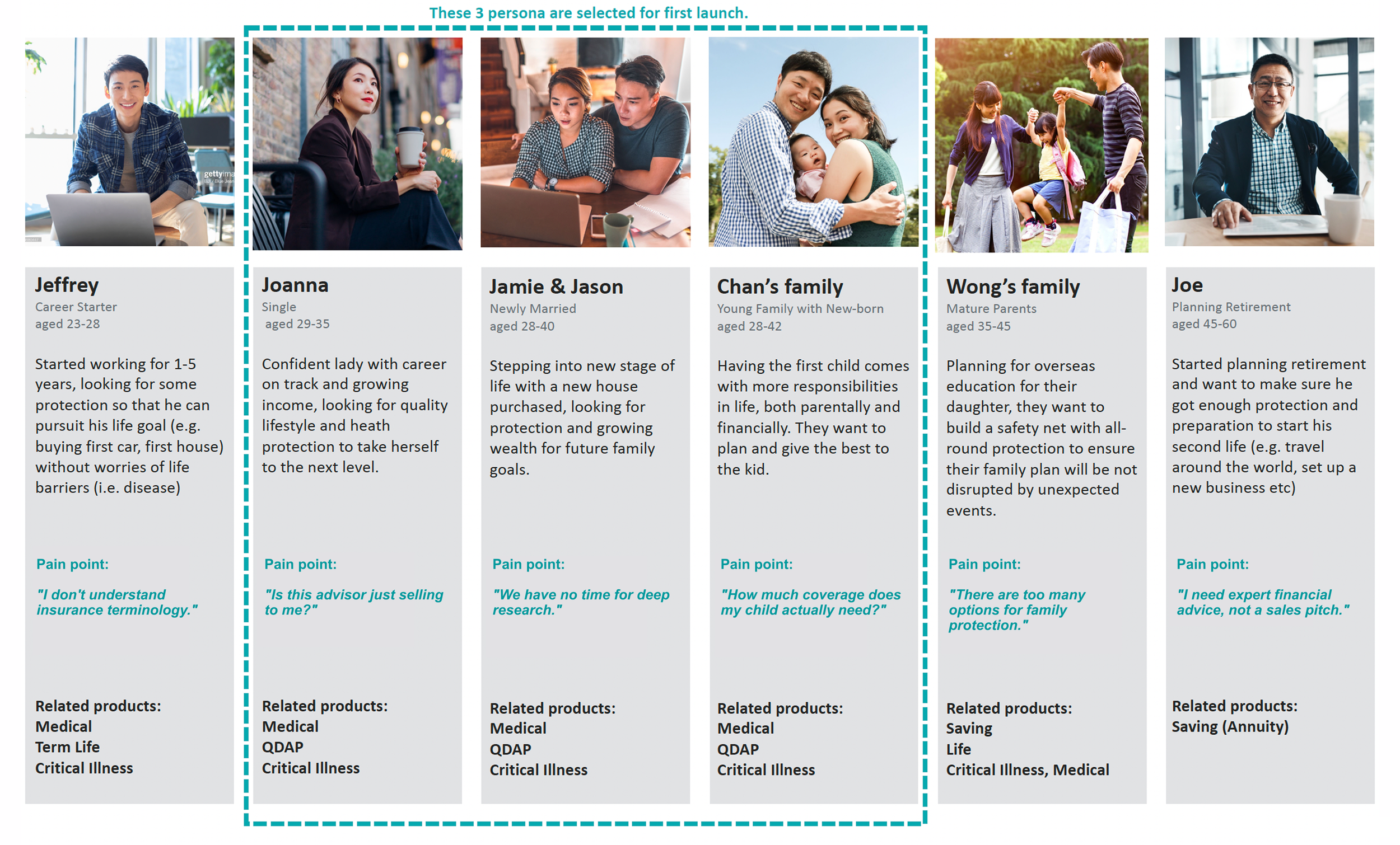
Segmenting the consumer:
6 life stage personas
Product strategy:
the "insurance robin hood"
Translating our brand archetype into actionable design principles.
1.
Radical Transparency
(Advocate Justice)
The Rule:
Provide brutal honesty on product quality, even if it makes insurers uncomfortable.
The UX Impact:
We must display "unflattering" data and unbiased ratings clearly, because consumer trust is our absolute highest-converting asset.
2.
The Guided Journey
(Protect Prosperity)
The Rule:
Support the user through their entire life stage, not just the transaction.
The UX Impact:
Shift the platform architecture from a pure "sales catalog" into a 3-part guided funnel: Education ➔ Guided Sales ➔ Claims Support.
3.
Ecosystem Leadership(Market Leadership)
The Rule:
Become the ultimate one-stop platform for the Hong Kong market.
The UX Impact:
Build a seamless, self-serve UI that naturally routes high-intent users directly to our internal advisor team without aggressive upselling.
Restructuring the Information Architecture
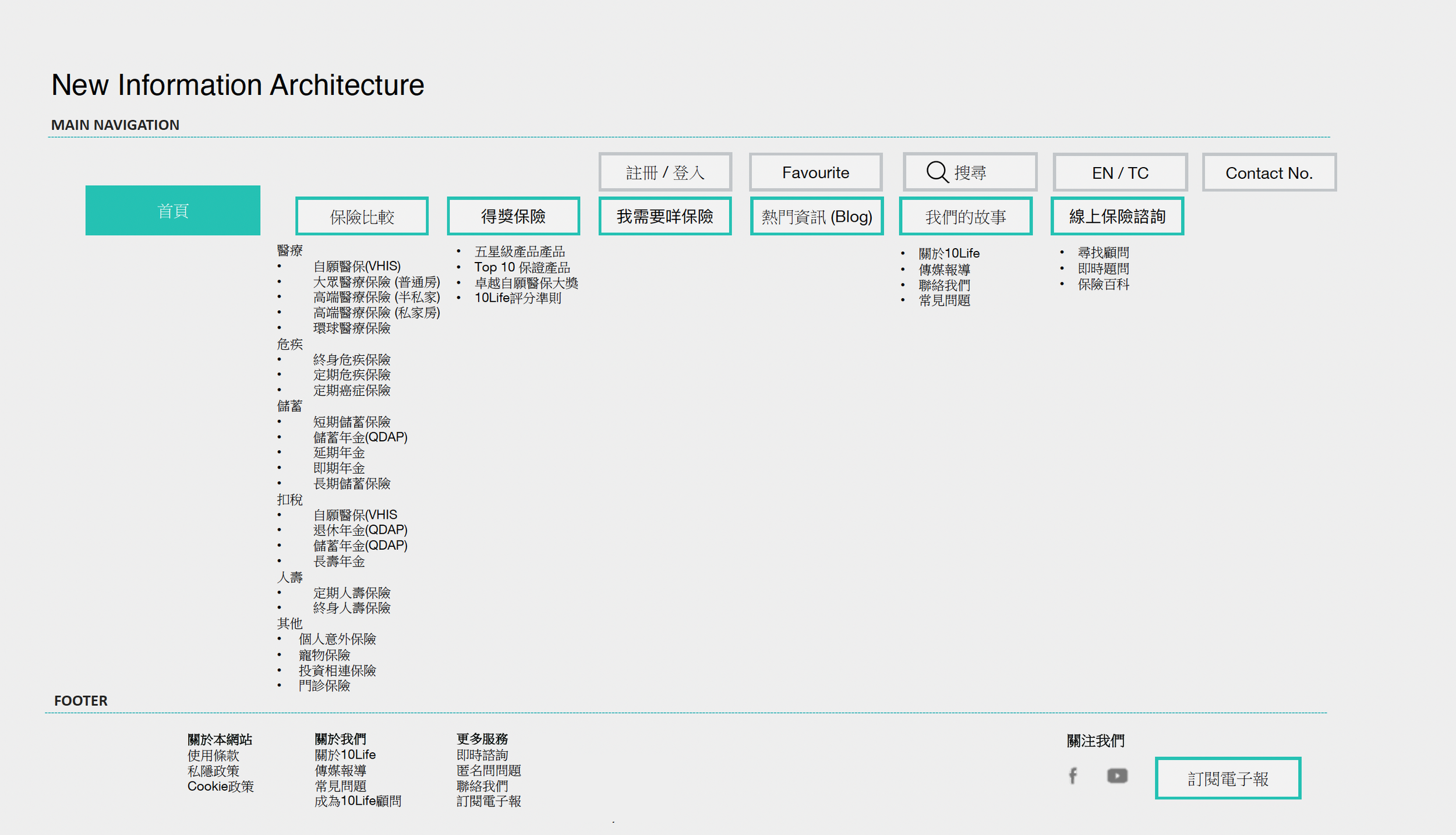
✗ Old Problem: Product categories were buried, and jargon was heavy.
✓ New Solution: We shifted to a "User-First Narrative" based on immediate user intent:
"I Need Insurance , "I Want Advice" , "I Want to Learn" ,"I Have Questions"
Design direction
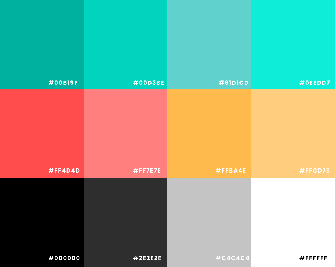
Coloring
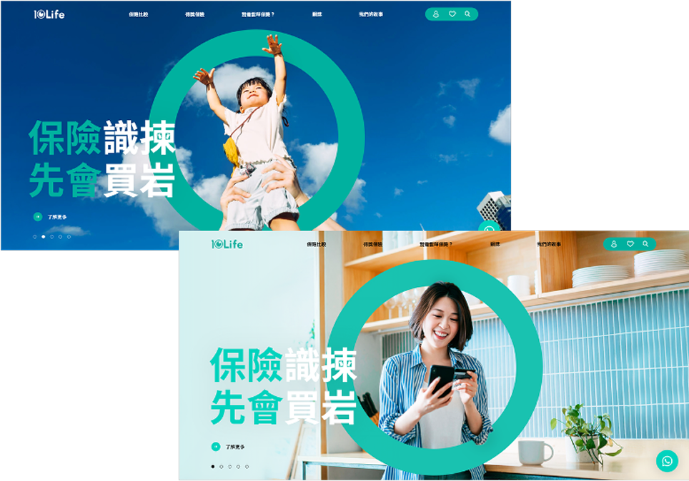
To appeal to a digital-first generation, we use a vibrant Teal to project a modern, youthful energy, but we anchor it with deep, solid grays so we never lose our professional financial credibility.
Symbol
The circle extends our brand identity into the UI while acting as a universal symbol for positive validation, signaling 'pass' and 'correct' to reassure users
Illustration
To break the traditional, intimidating stereotype of insurance, we designed characters that actually step into people's real lives. This humanizes the platform, making users feel welcomed rather than overwhelmed by complex actuarial data

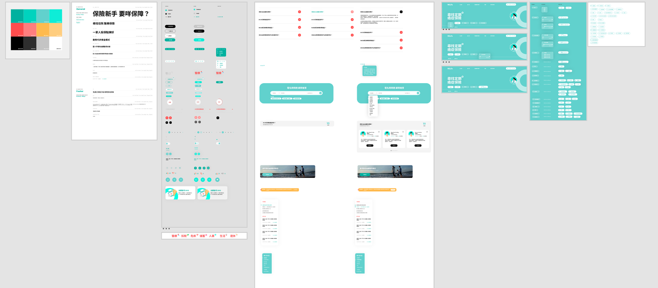
From direction to design system
Developing a modular component library allowed us to scale design efficiently and maintain brand consistency, streamlining content updates and future-proofing the website for growth
Journey 1 - Discovery"I Need Insurance”
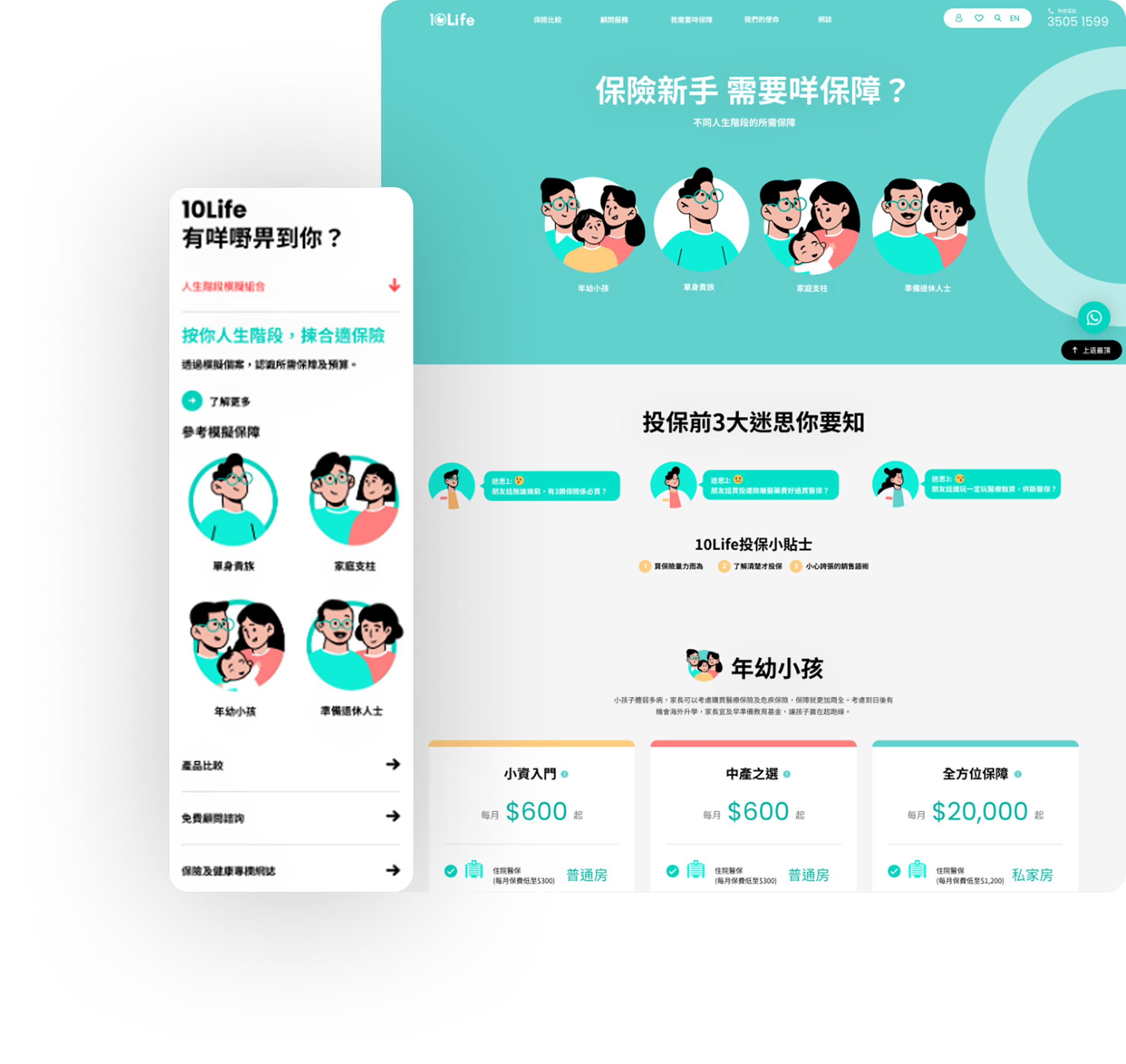
Life Stage First, Not Product Type First.
✕ Before (Product-Centric)
"What type of insurance do you need?"
Users were immediately overwhelmed by actuarial jargon, causing severe drop-off.
92%
Selected correct stage on first try
Up from 75% baseline
✓ After (User-Centric)
"What stage of life are you in?"
Users instantly recognize themselves. The system auto-recommends tailored product categories.
IMPACT
30sec
Time-to-Clarity for product discovery
Reduced from 5 minutes
User Flow: Home ➔ "What do I need?" ➔ Life Stage Selection ➔ Product Decoder
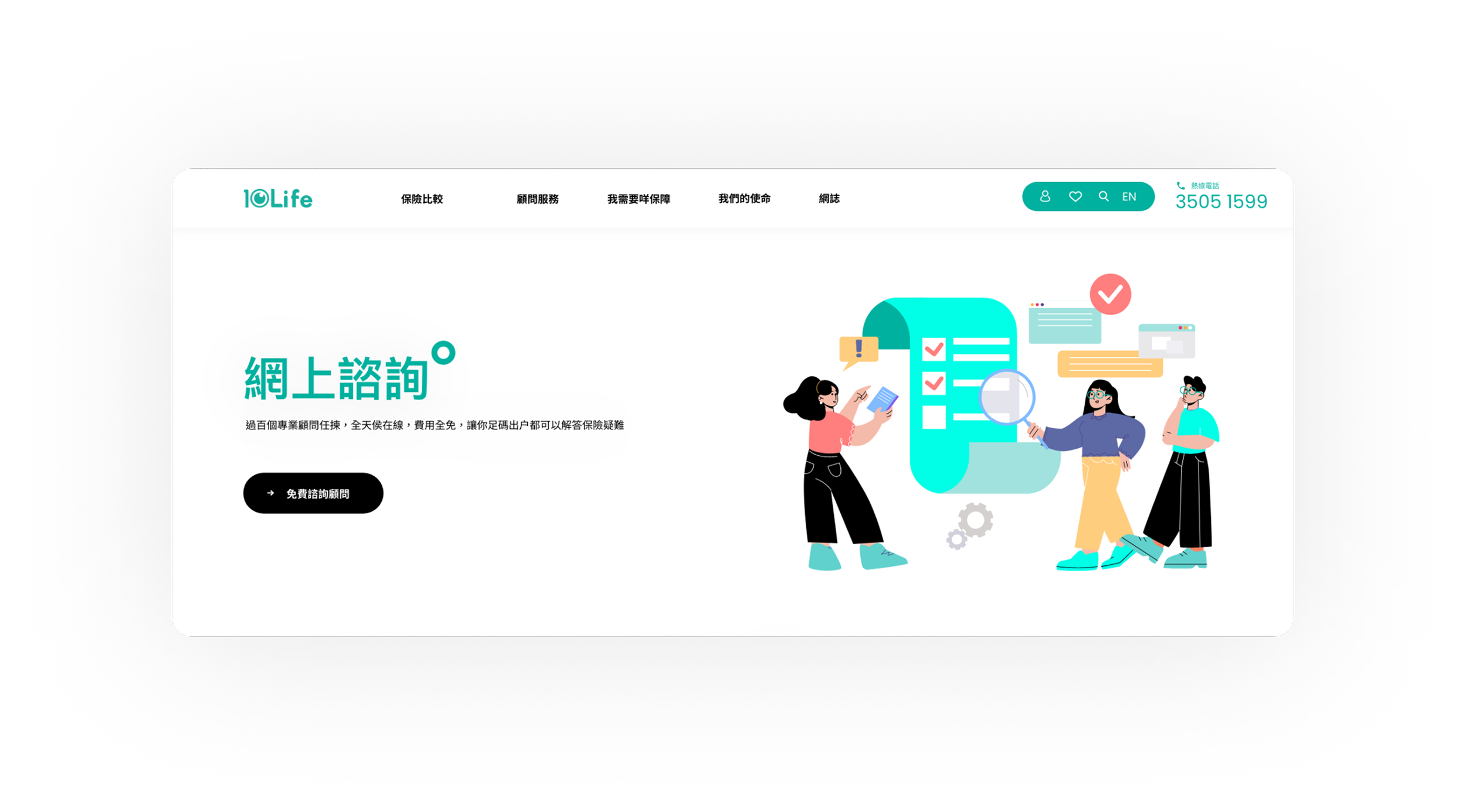
Journey 2 - Consultation"I Want Advice"
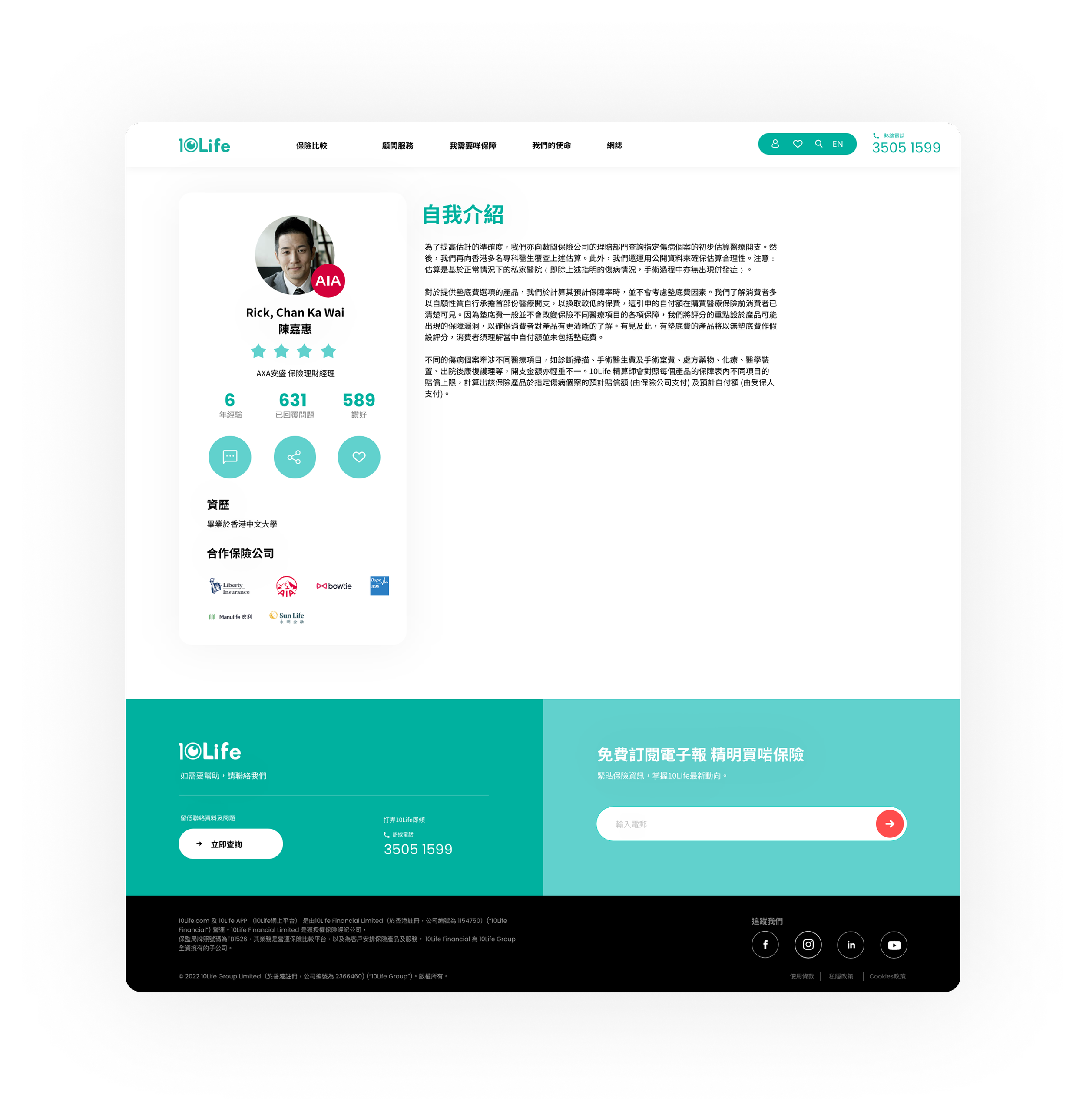
Separating Education from Sales to drive organic conversion.
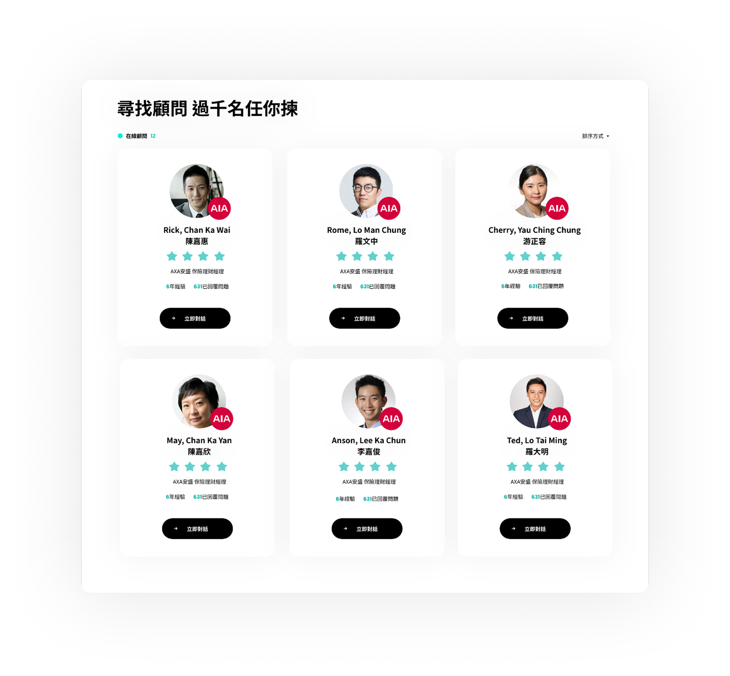
✕ Before (Sales-Driven)
Advisors ranked by sales volume.
This incentivized aggressive upselling and actively destroyed consumer trust.
2.8x
More consultation bookings
For advisors with 4.5+ stars
✓ After (Trust-Driven)
Advisors ranked by customer satisfaction.
We created a "TripAdvisor" model for insurance, incentivizing high-quality, unbiased advice.
IMPACT
High Intent
Quality leads generated
From the Anonymous Q&A loop
User Flow: Home ➔ "Find Advisor" ➔ Browse Profiles ➔ View Reviews ➔ Book
Journey 3 - Education"I Want to Learn"
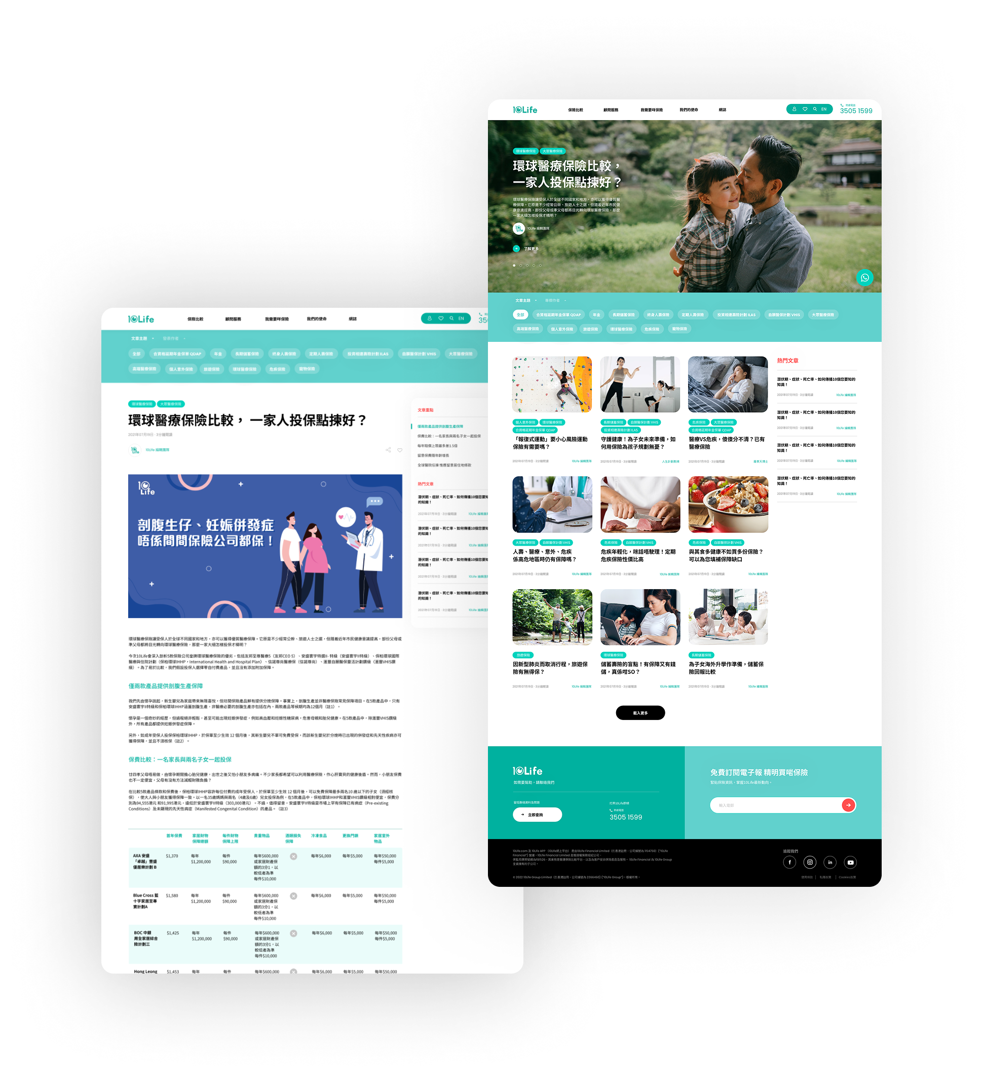
Separating Education from Sales to drive organic conversion.
✕ Before (Mixed Intent)
Blog mixed with hard sales pitches.
Readers couldn't tell if they were learning or being sold to, which immediately eroded trust.
+78%
Lift in Advisor Booking Conversion
Increased from 18% to 32%
✓ After (Trust-First)
Pure education, contextual soft-CTAs.
The article is purely educational. "Related Products & Advisors" only appear at the very end of the reading journey.
IMPACT
Organic
Sales Discovery
Users click "Book" voluntarily
User Flow: Home ➔ Encyclopedia ➔ Read Article ➔ Discover Related Products ➔ Book Advisor
Journey 4: Community Trust"I Have a Question"
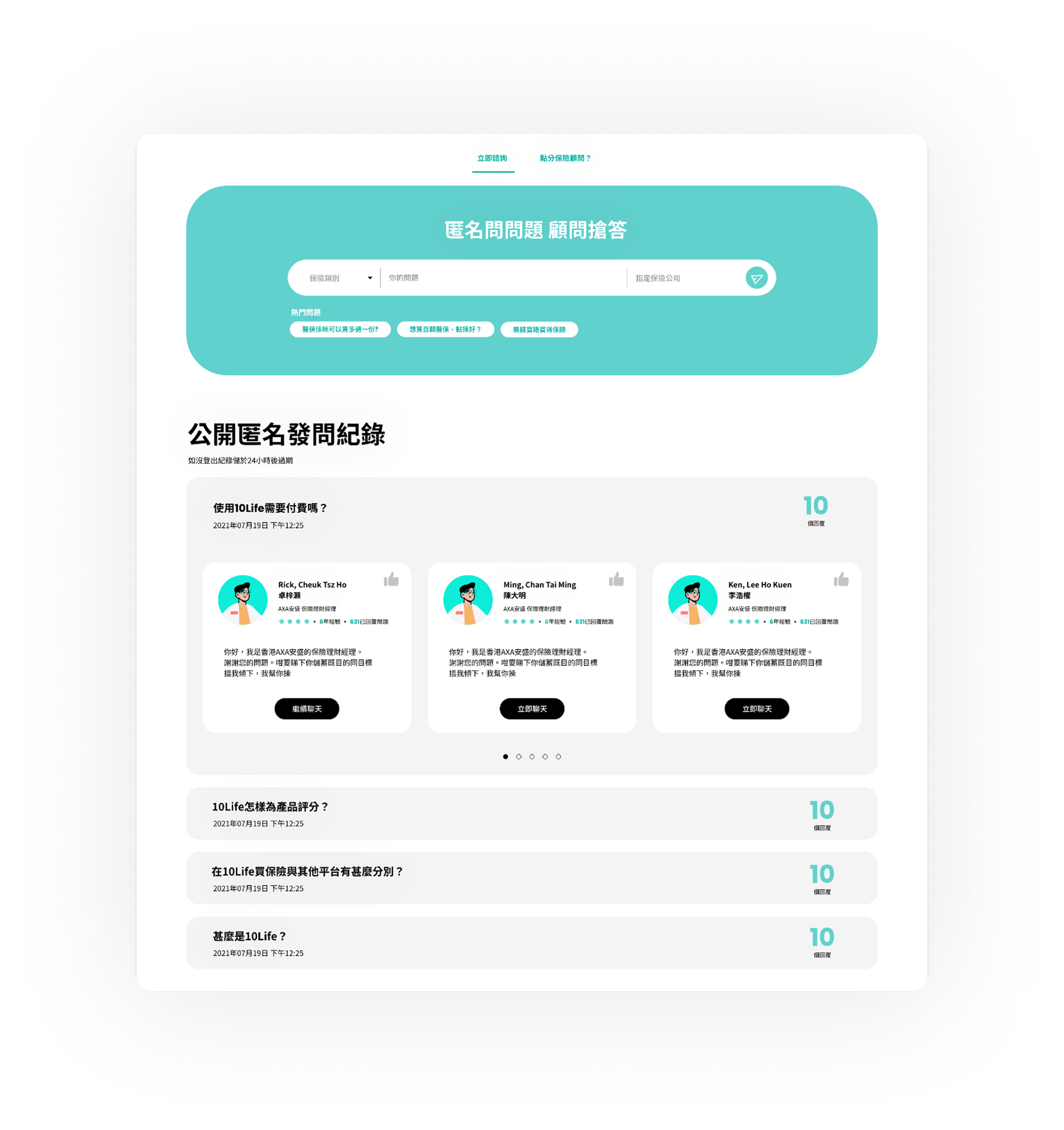
Building a reputation-driven Q&A loop to generate high-intent leads.
✕ Before (Hidden & Broken)
Private, commission-driven Q&A.
Users couldn't find answers, and advisors weren't incentivized to reply unless a sale was guaranteed.
41%
Booking Conversion Rate
Up from 23% (+78% Lift)
✓ After (The Reputation Flywheel)
Public, Anonymous Q&A.
Users ask freely. Advisors compete publicly to give the best advice. The best answers earn visibility and direct leads.
IMPACT
High Intent
Questions Answered
Within 4 hours
User Flow: Home ➔ "Find Advisor" ➔ Browse Profiles ➔ View Reviews ➔ Book
Core FeatureThe 10/10 Transparency Score
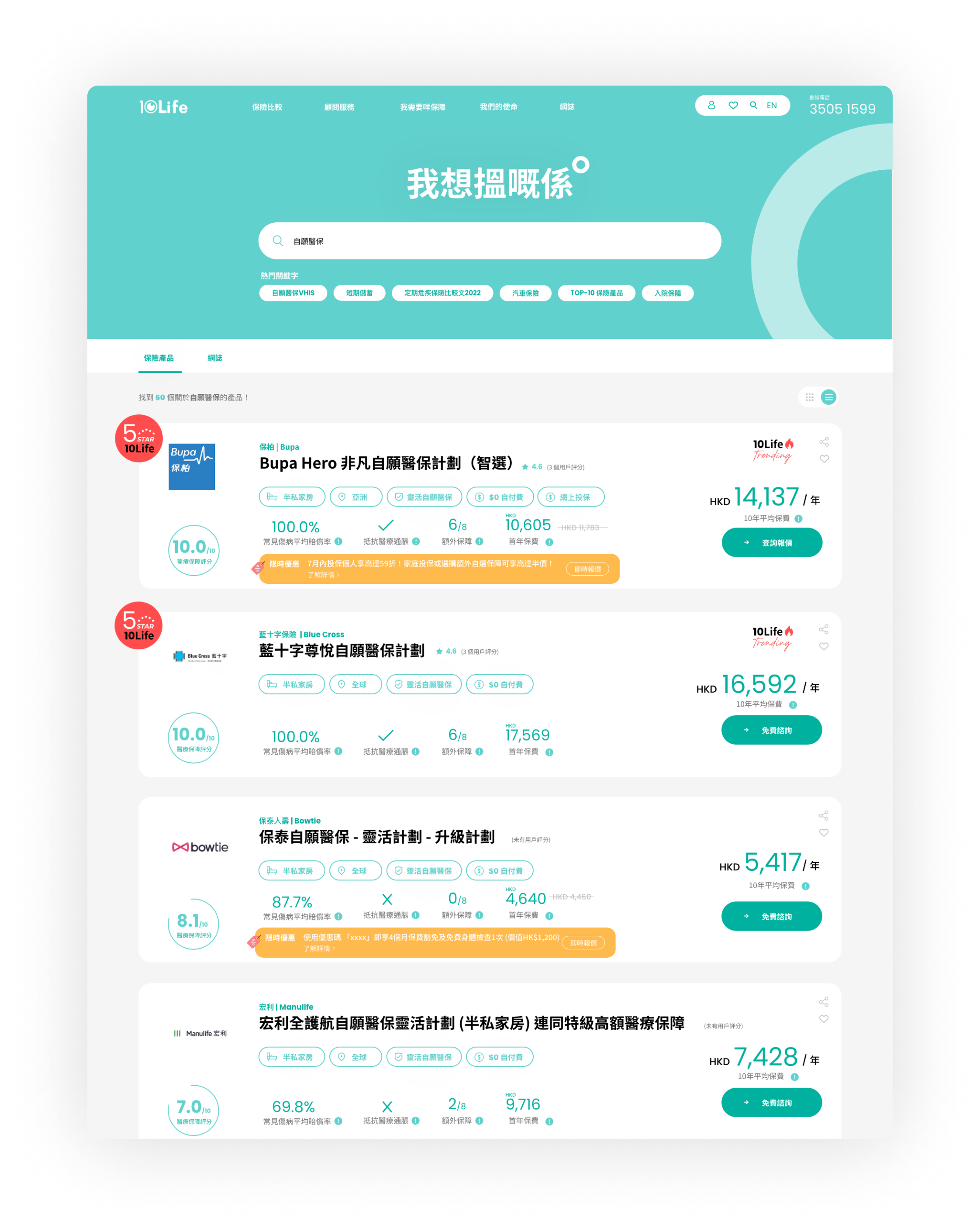
Translating complex actuarial data into a simple, highly converting UI.
IMPACT
94%
Adoption Rate
(Users actively use scores to compare)
87%
Score Comprehension
(Up from 42% baseline)
+31%
Increase in Decision Confidence
+28%
Overall User
Trust Rating
PROBLEM
When an advisor recommends a product, users always wonder: "Is this actually good, or are they just chasing a commission?"
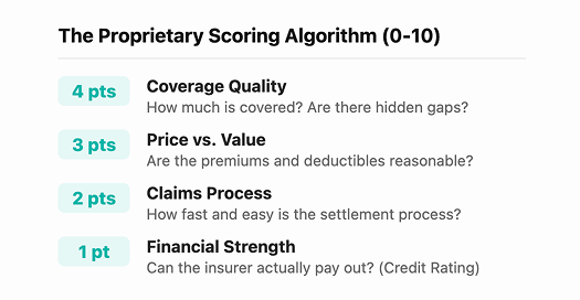
SOLUTION
Core FeatureThe "Highlight Differences" Toggle
Solving cognitive overload through smart data filtering.
We introduced a single toggle switch: "Show Differences Only."
Identical data is hidden. Different data is kept and highlighted in Teal. Users see ONLY what matters to their purchasing decision.
IMPACT
-55%
Adandonment Rate
Dropped from 40% to 18%
+78%
Comparison to Booking
Conversion jumped 18% → 32%
-47%
Faster Decision Time
From 4m:32s to 2m:18s
+105%
Pages Per Session
Increased from 2.1 to 4.3
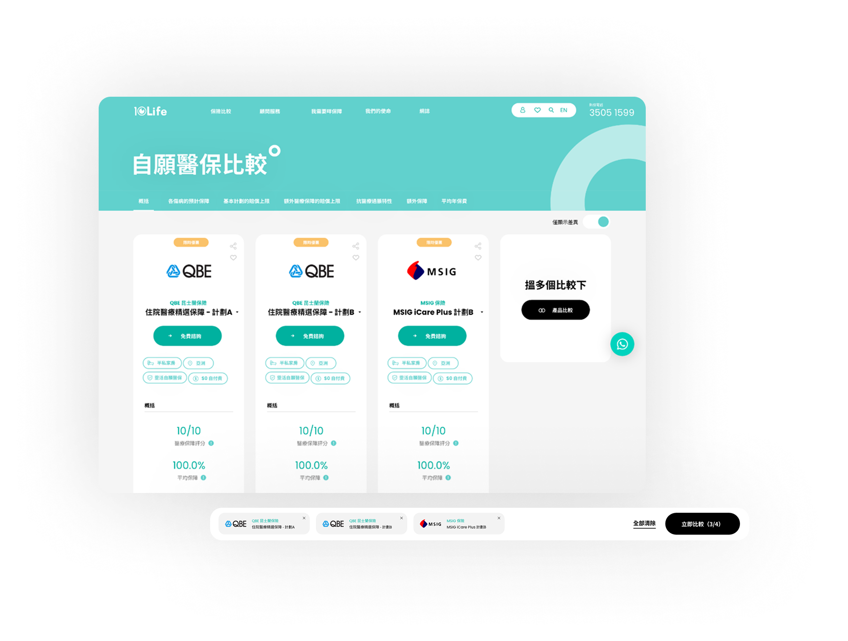
PROBLEM : Cognitive Overload
Traditional comparison tables show 30+ rows of data, forcing horizontal scrolling and deep analysis. It causes immediate user fatigue.
User Testing Quote: "I see a thousand numbers. I quit."
SOLUTION : Dynamic Filtering
Mobile Optimization
Given that 70% of our traffic is mobile-first, we've optimized the experience to ensure seamless mobile interactions."