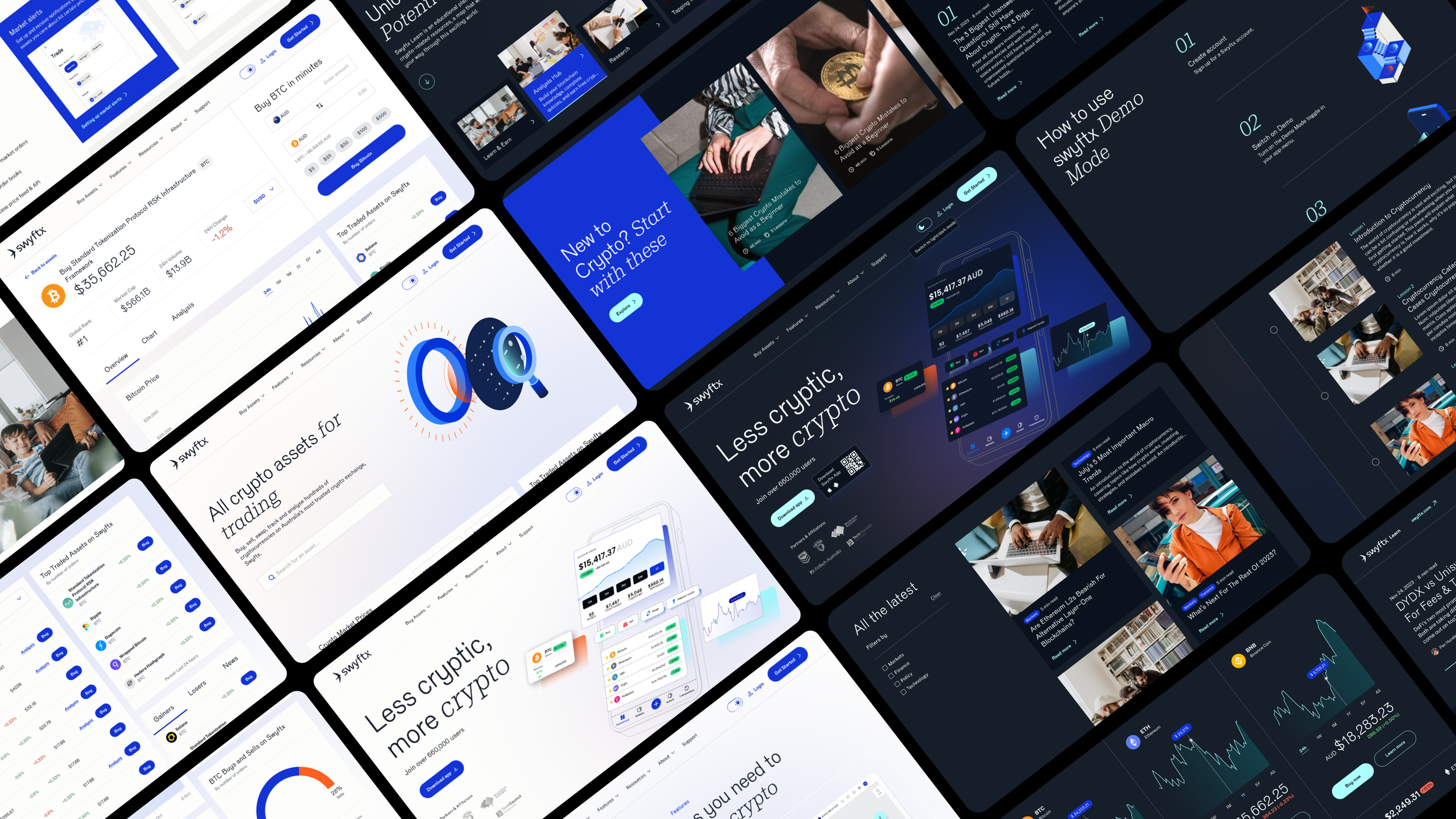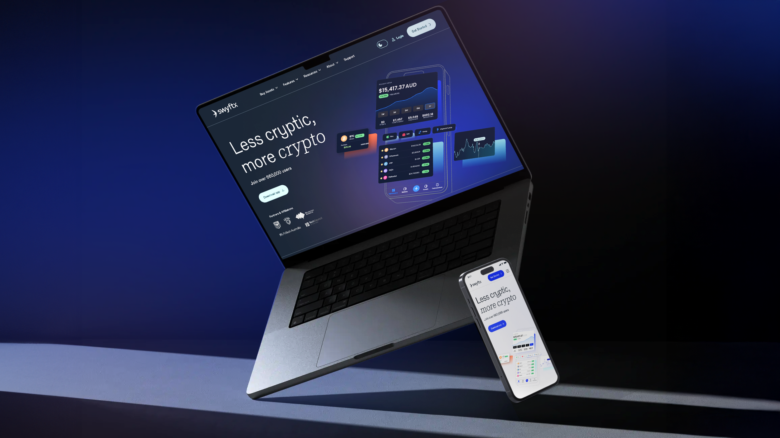
swyftx website revamp
swyftx website revamp
my role :
ux design / ui design
timeline :
2024 - 2025
background
Swyftx is a leading Australian cryptocurrency platform focused on making crypto approachable for everyday users, with a large retail base across web and mobile and hundreds of supported assets and features like demo trading and advanced charts.
problem
The experience had become fragmented: dense content, unclear CTAs, and inconsistent patterns across mobile and desktop increased cognitive load, slowing discovery, comparison, and key conversion moments on Homepage, Assets, Features, Demo, and Learn.
the ask
Redesign the core surfaces to deliver a brand‑aligned, all‑in‑one experience that simplifies navigation, standardizes components and motion, and scales an accessible, tokenized design system across devices to improve discoverability, comprehension, and trust.
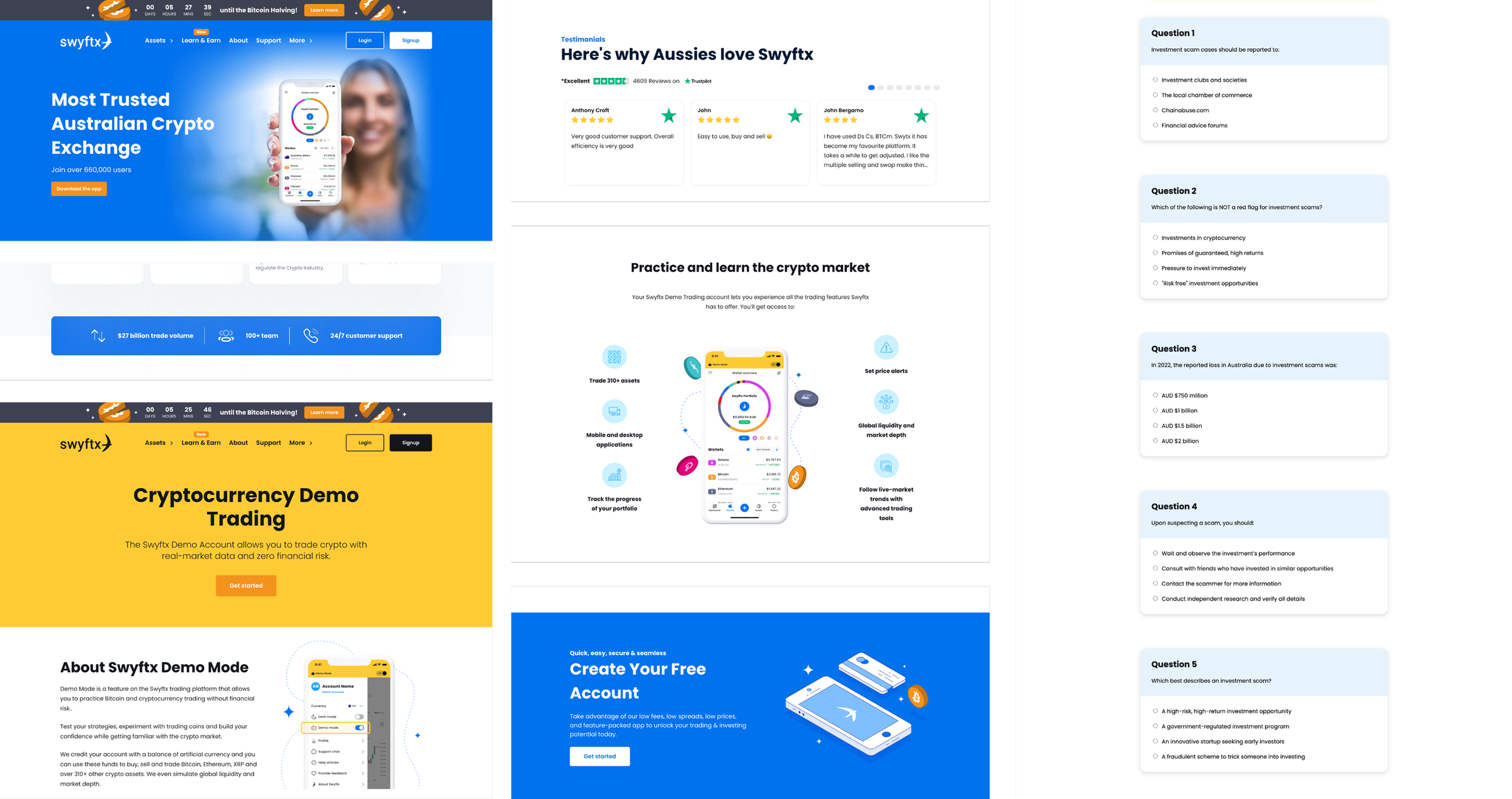
existing website
we carefully analyzed all stakeholder feedback and translated it into tangible design enhancements.
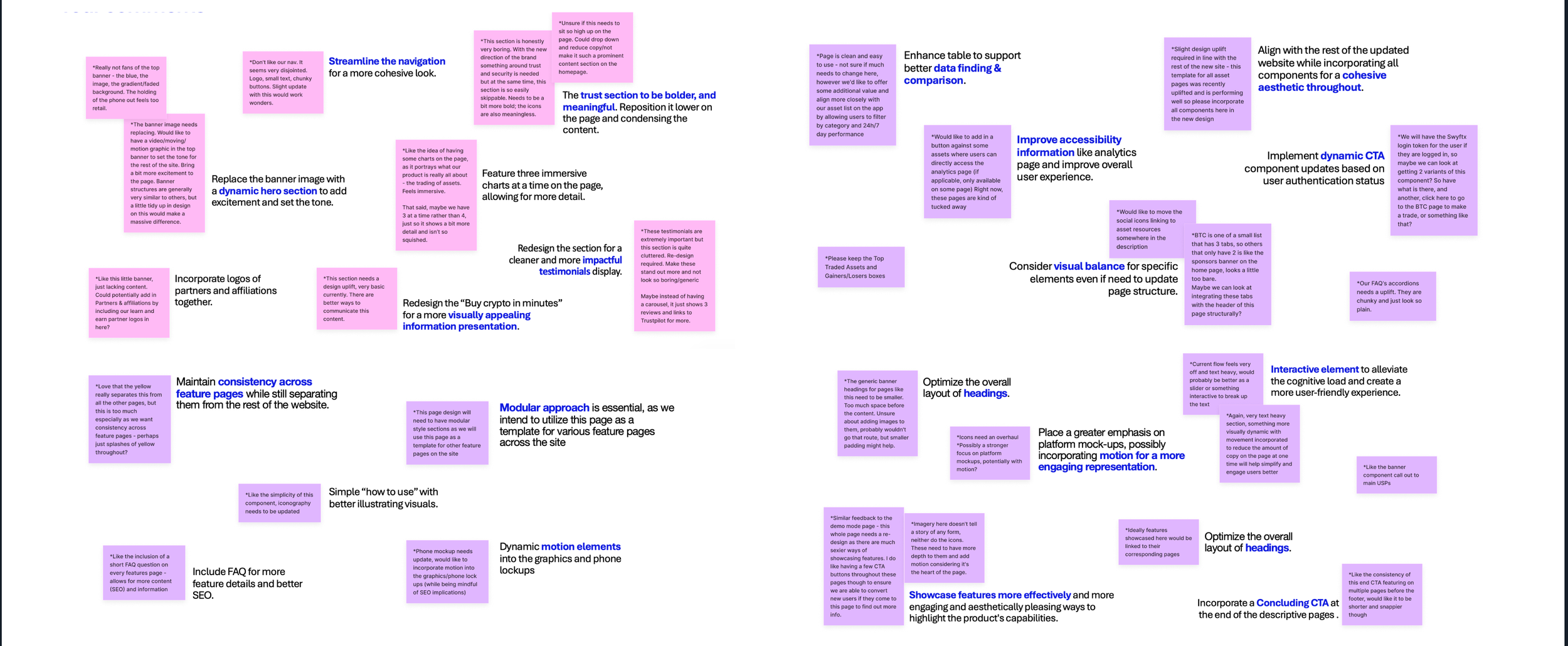
stakeholder insights and problem clustering
01
enhanced navigation usability
Streamline global navigation with clear labels and predictable groupings to improve usability and discoverability.
02
immediate value
messaging
Deliver clear, impactful messages that address user needs right away, emphasizing benefits and solutions.
03
elevated research experience
Show immersive charts and enhance tables with filter options. Ensure mobile-friendly controls while minimizing visual clutter for better scannability.
04
engaging
interactivity
Transforms passive reading into an immersive experience, making information more memorable and accessible.
05
live data
environment
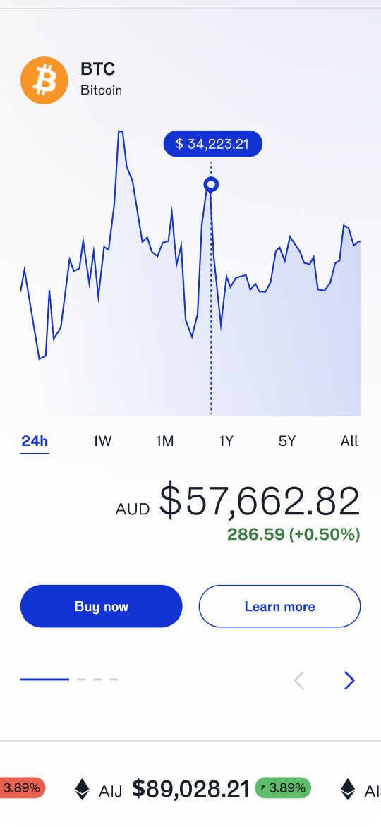
See real‑time prices and trends at a glance, then buy with a single, confident click using mock funds to practice safely
06
cohesive learning experience
Enhance clarity in course outcomes and progress tracking while establishing consistent patterns for quizzes and course structure to improve overall understanding and engagement.
benchmarking highlights
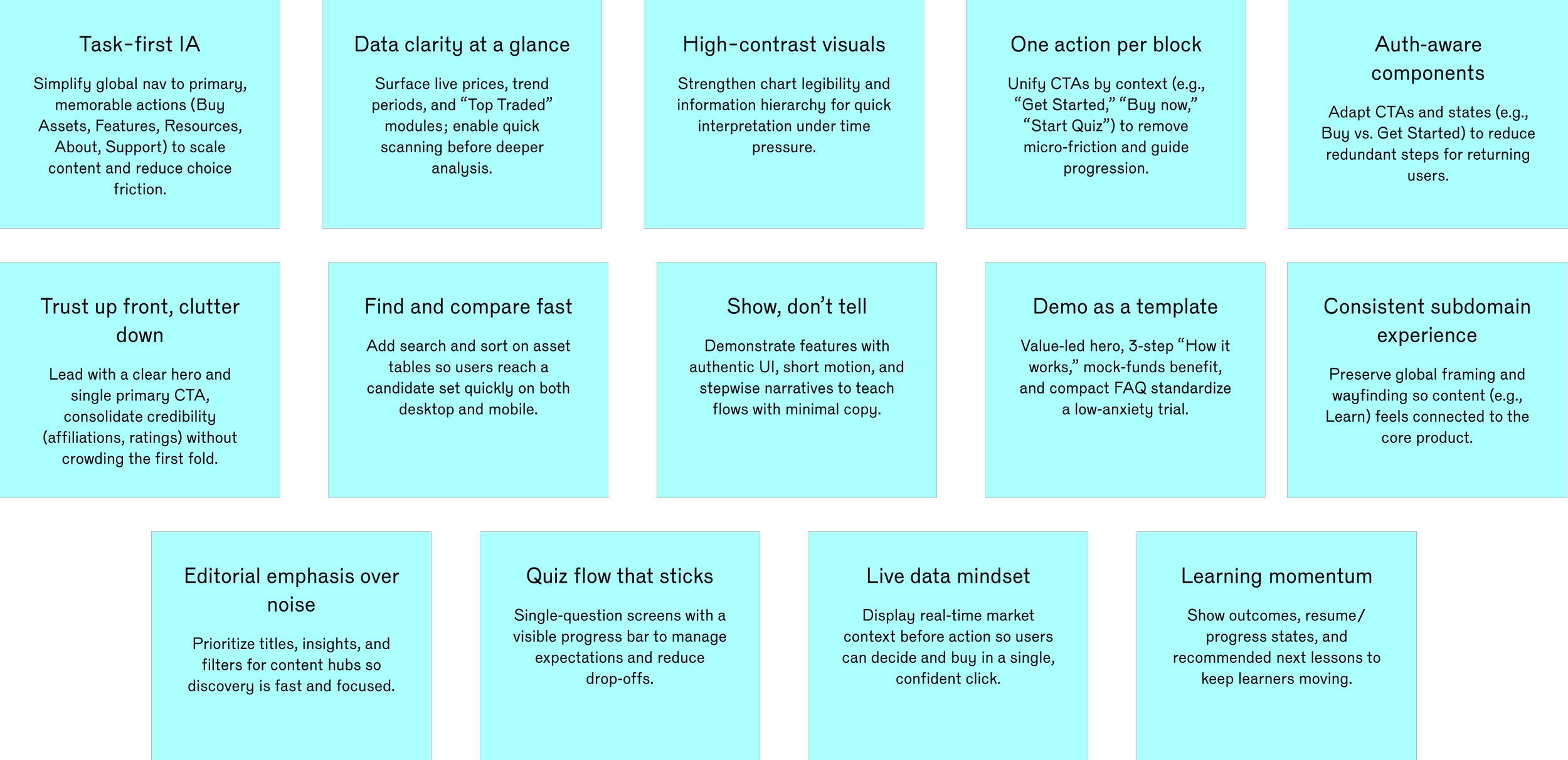
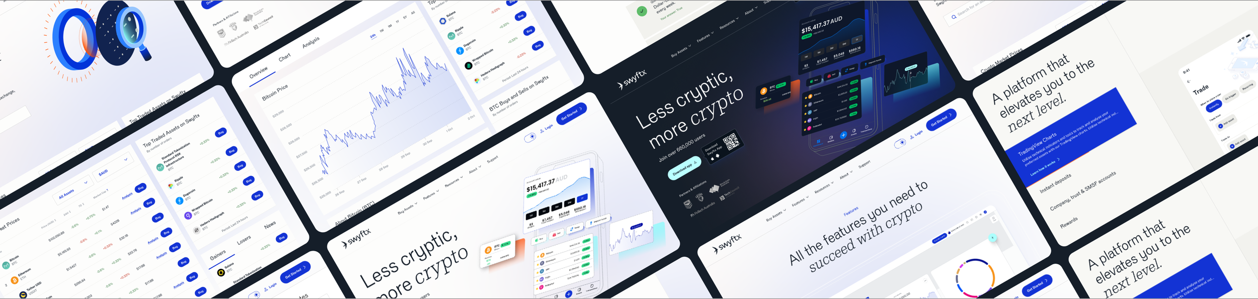
design approach
01
building trust with visual clarity
Revamping our website with dynamic visuals and clear, impactful content to enhance user trust and streamline the buying process.
02
live content & enhanced information accessibility
Enhance accessibility, data discovery, data analysis, table functionality, visual balance, and and dynamic CTAs tailored to user status.
03
engaging feature showcase
Incorporate motion for dynamic engagement and showcase features in aesthetically pleasing, effective ways to highlight capabilities
04
exclusive learning experience
Implement a progress tracking system to record lesson completion and recommend personalised lessons based on user interest.
01
building trust with visual clarity
Enhanced UI consistency with dynamic hero banners, lifestyle photos, and unified design elements builds trust and improves the user experience.
establishing consistency
Leading users through visual narratives
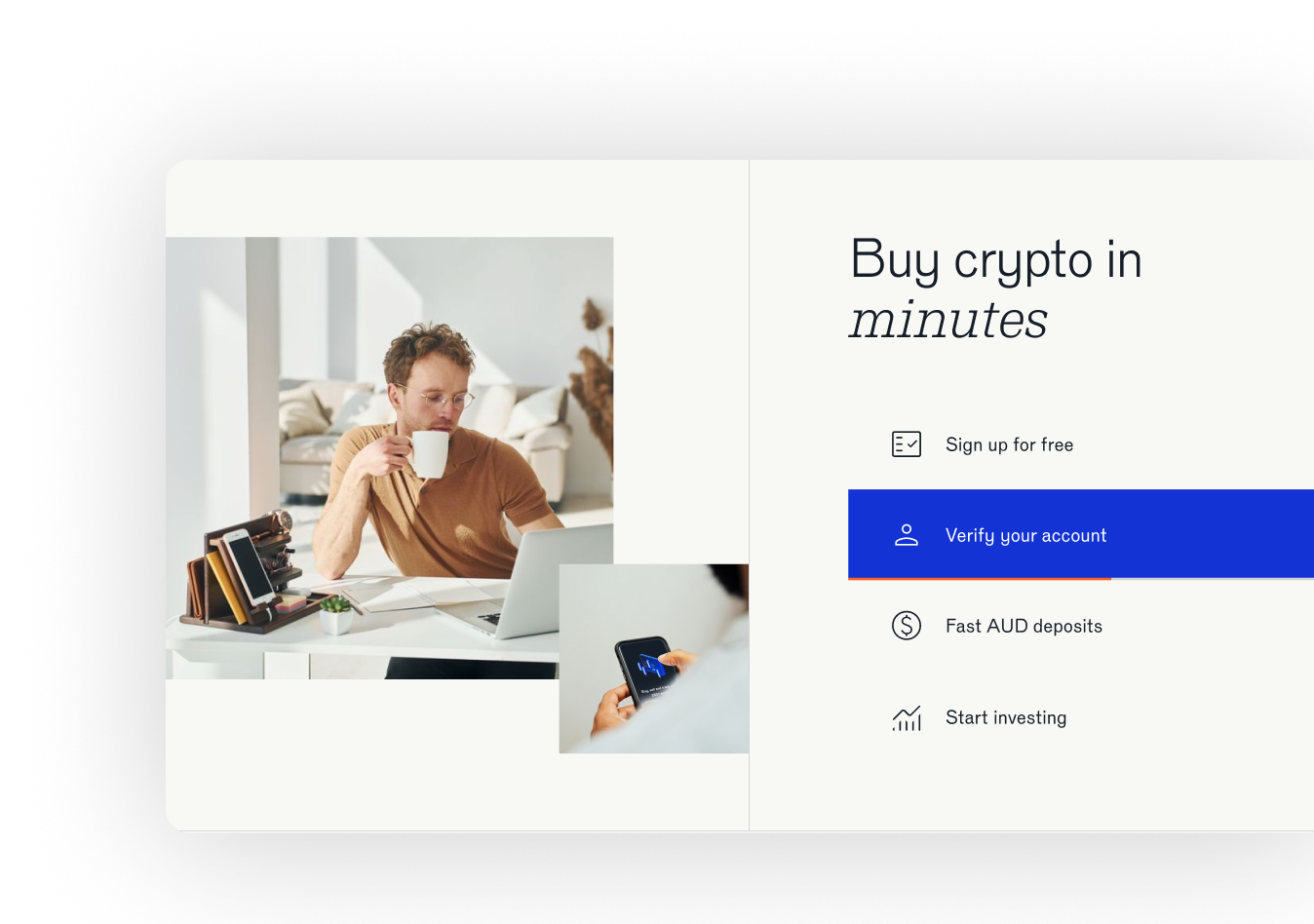
Redesign the “Buy crypto in minutes” for a more visually appealing information presentation.
Enhanced all charts and informational graphics with high contrast and clear hierarchies to improve readability for users.
high contrast and visual hierarchy
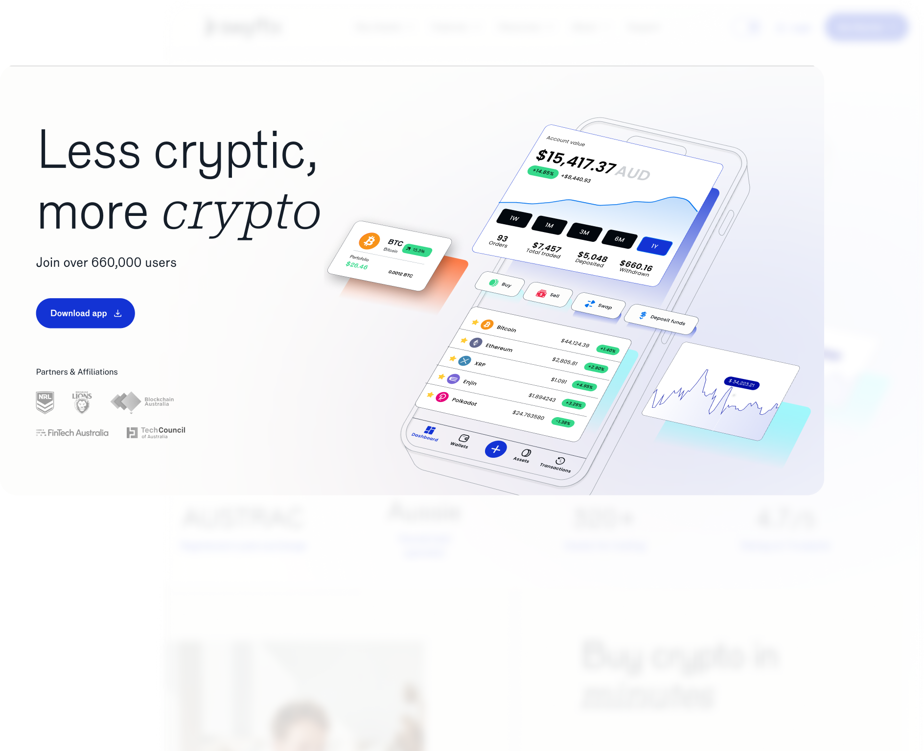
improve accessibility information
02
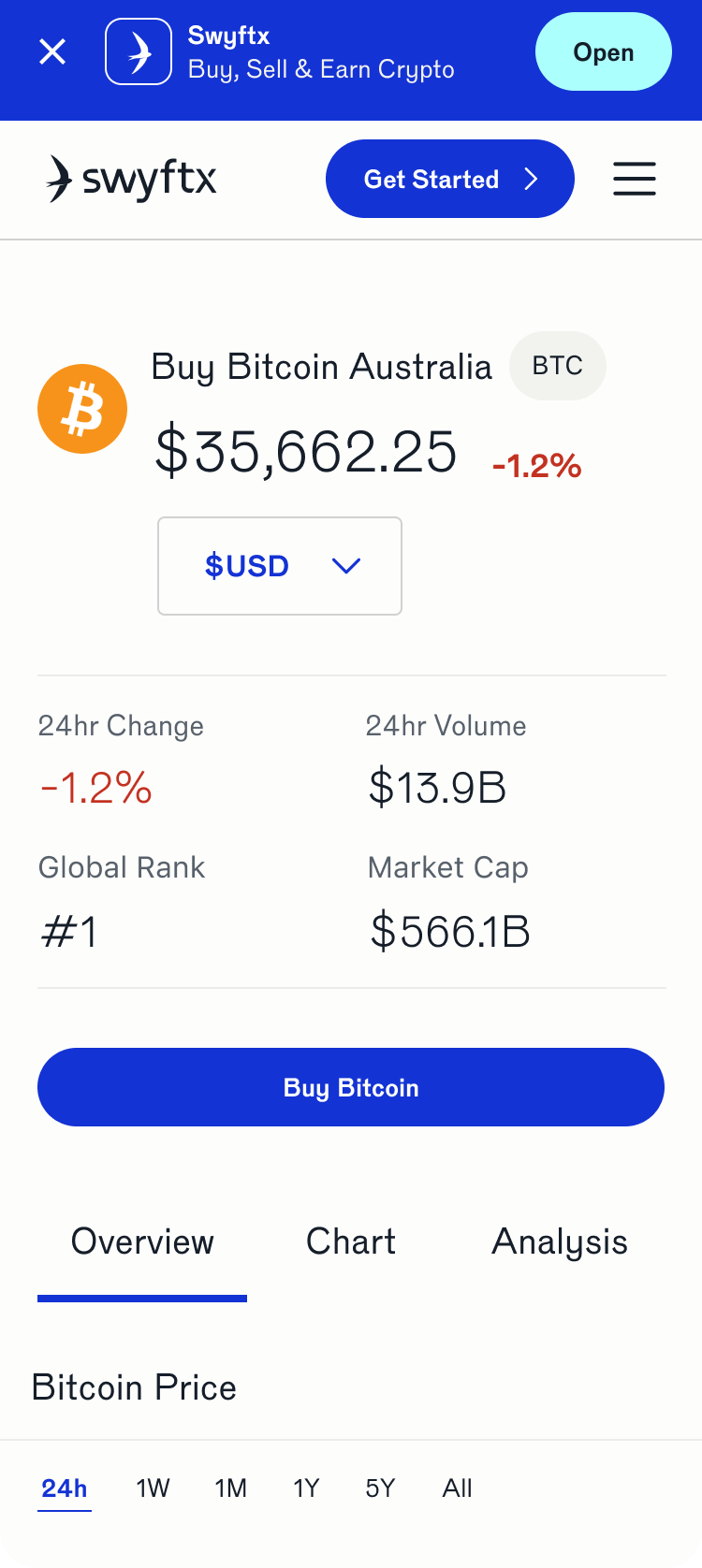
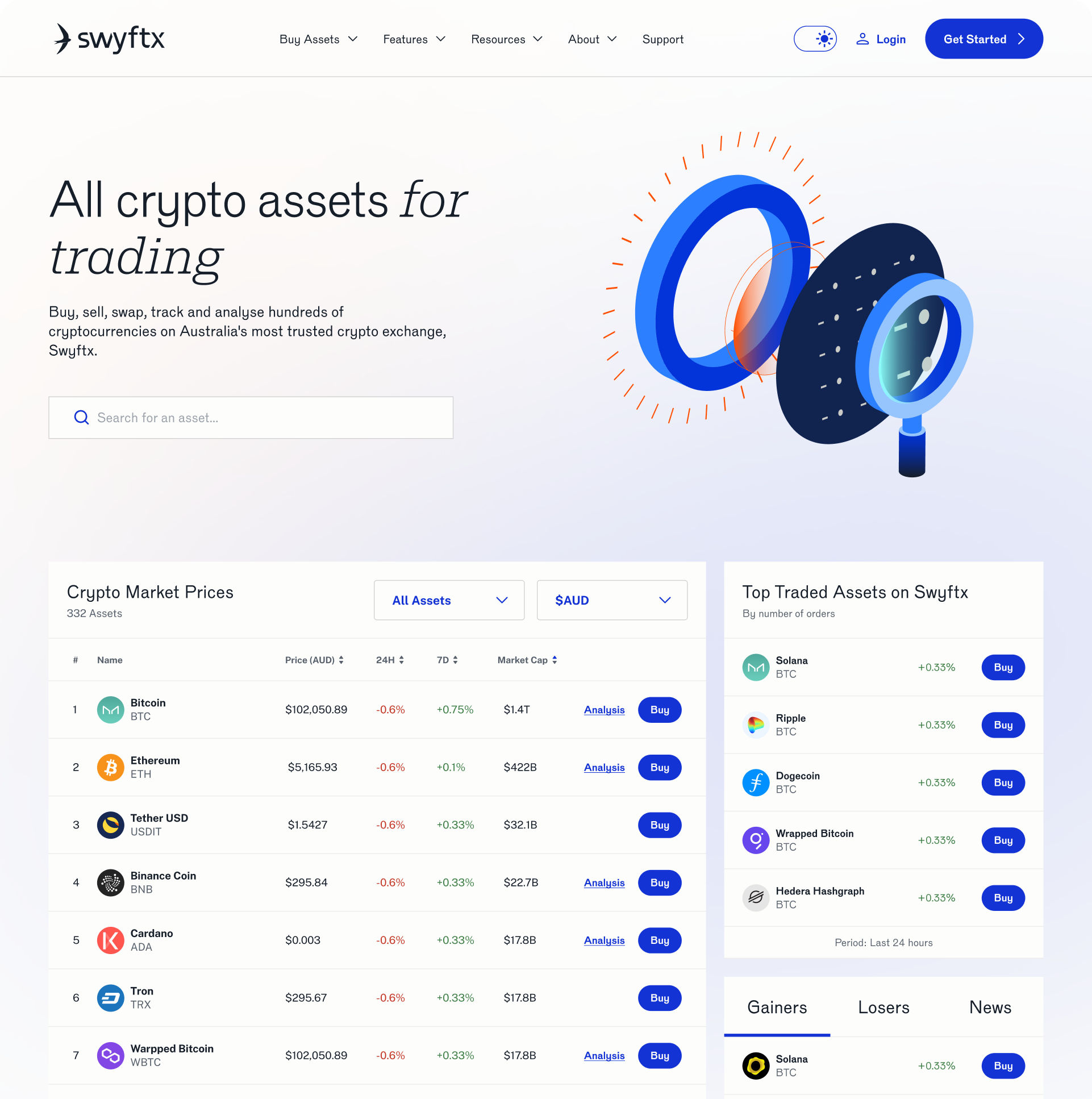
Introduced a searching & sorting function to help users easily discover trends or specific cryptocurrencies.
effortless crypto discovery
Implement dynamic CTA component updates based on user authentication status.
dynamic CTAs for streamlined user goals

engaging feature showcase
03
drive engagement with interactive features
Interactive element to alleviate the cognitive load and create a more user-friendly experience.
Step-by-step approach leads the user's eye flow in an attractive, pleasing way, highlighting the product's capabilities and avoiding high drop-off rates due to information overload.
step into immersion
exclusive learning experience
04
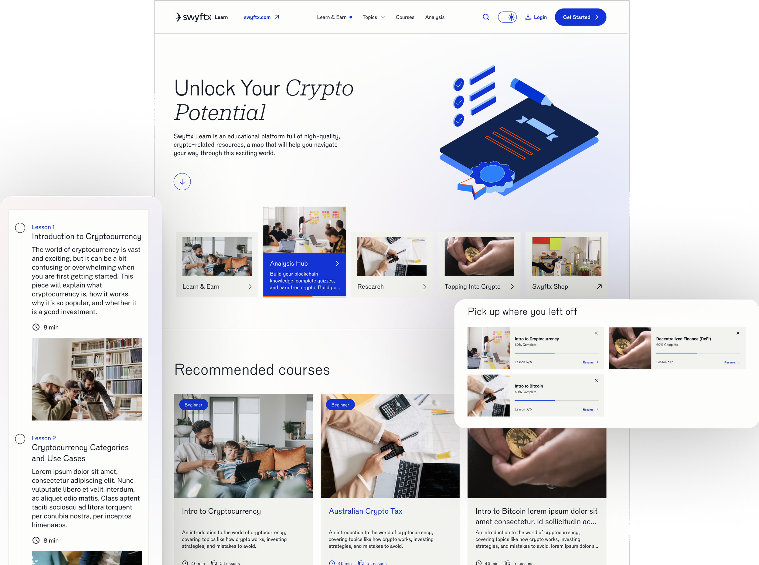
Track lesson progress and achievements effectively, designed to motivate students with clear insights into learning outcomes and educational advancements
lesson progress achievement tracking
Remind users of what they have learned upon revisiting, with a progress bar in the UI to easily track their progress and show how much is left to complete.
overview reminder
Automatically reveal information, restructure the information architecture by grouping different class types, and guide user focus to better understand the information.
reveal the information automatically
exclusive learning experience
04
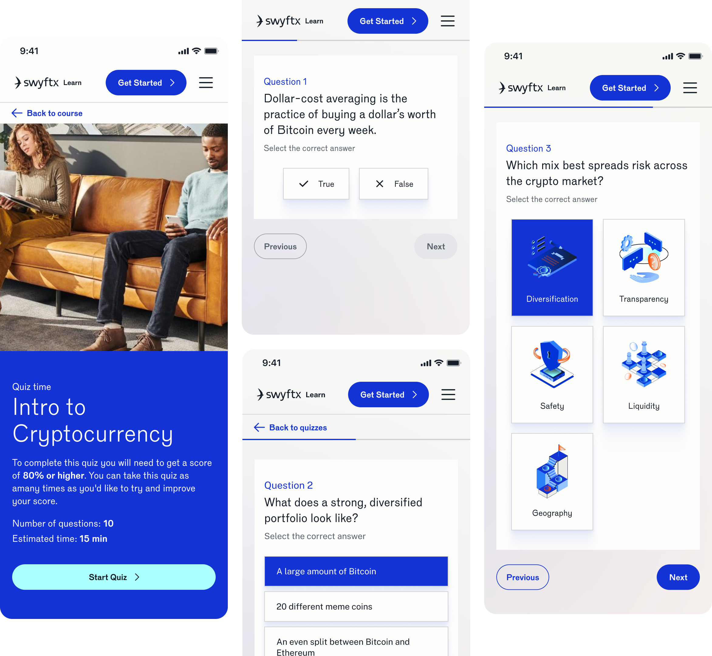
Redesigned the quiz content and structure. Initially, the page lacked clear user flow and guidance. We introduced a progress bar for clarity, kept the content interesting with colorful graphics, and focused on reducing the drop-off rate during the quiz.
a new look for quizzes
design system
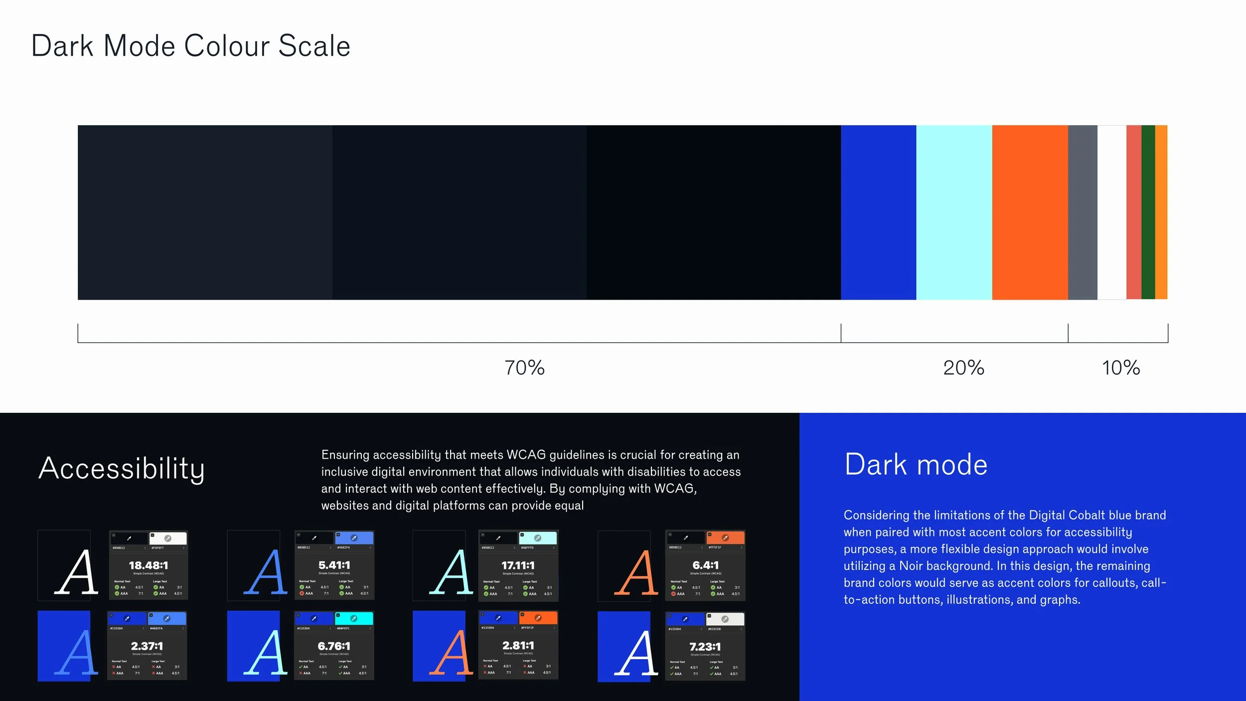
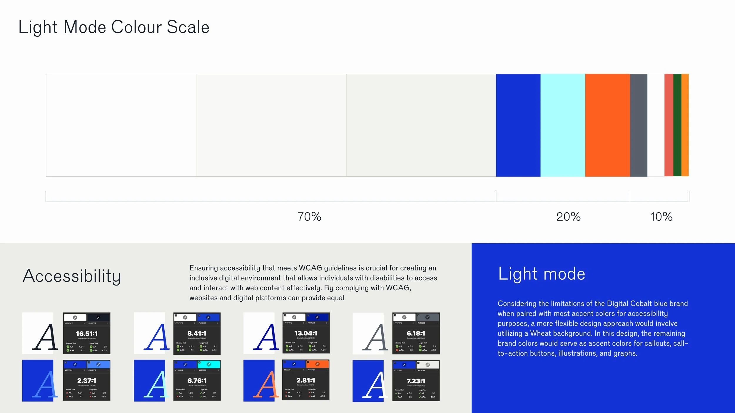
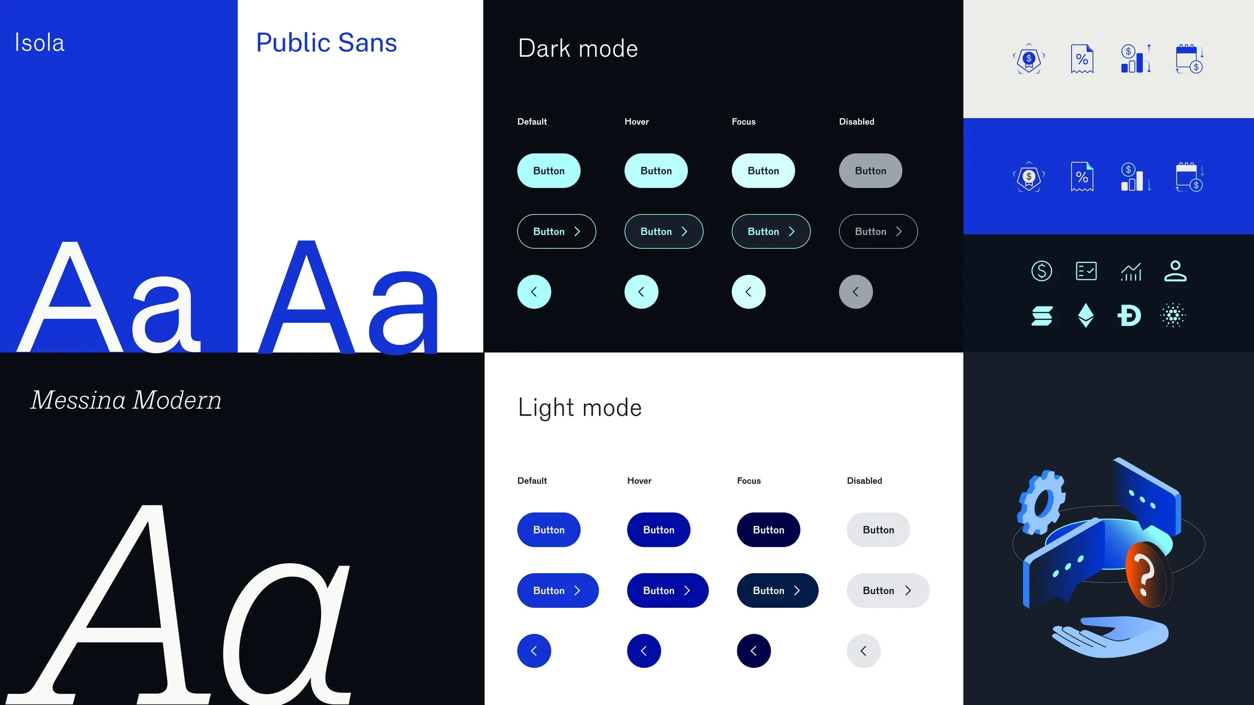
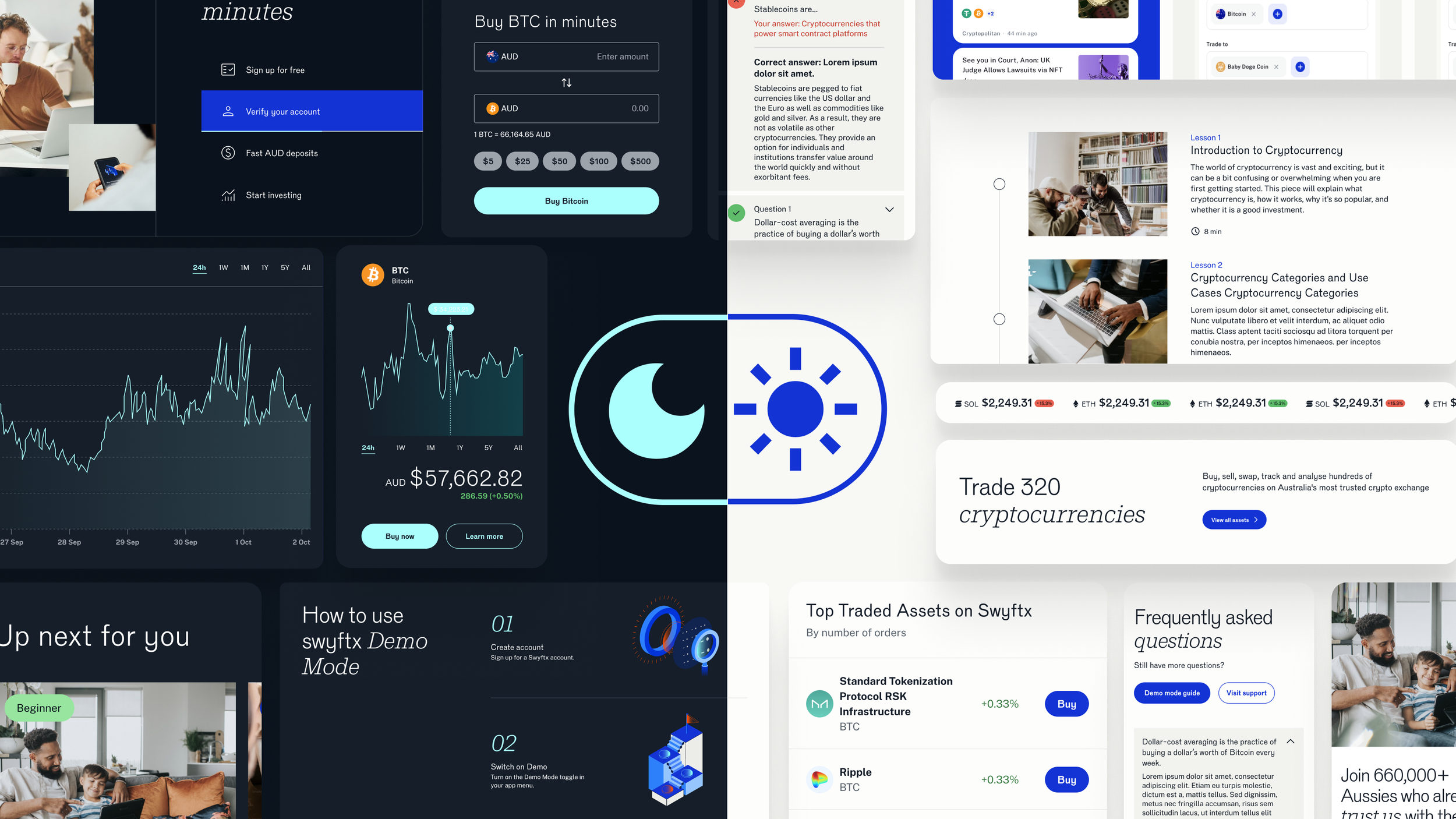
A theme is a collection of token values designed to achieve a certain look or style. Themes are how we switch colour schemes and styles everywhere using a single set of tokens.
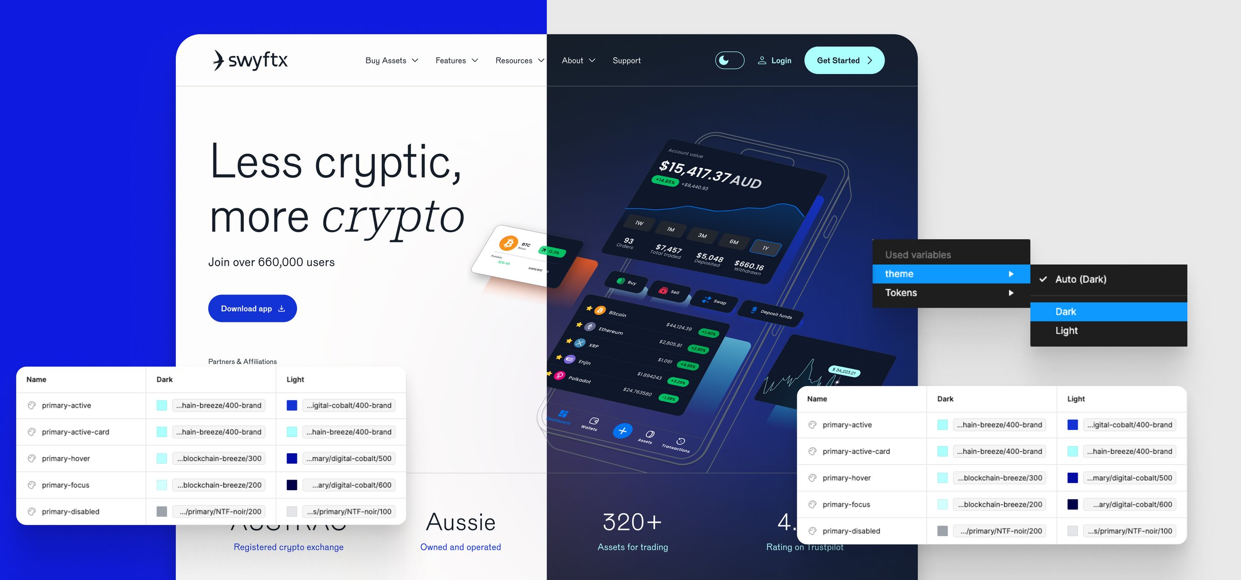
Switching themes by setting tokens